January
03 2022
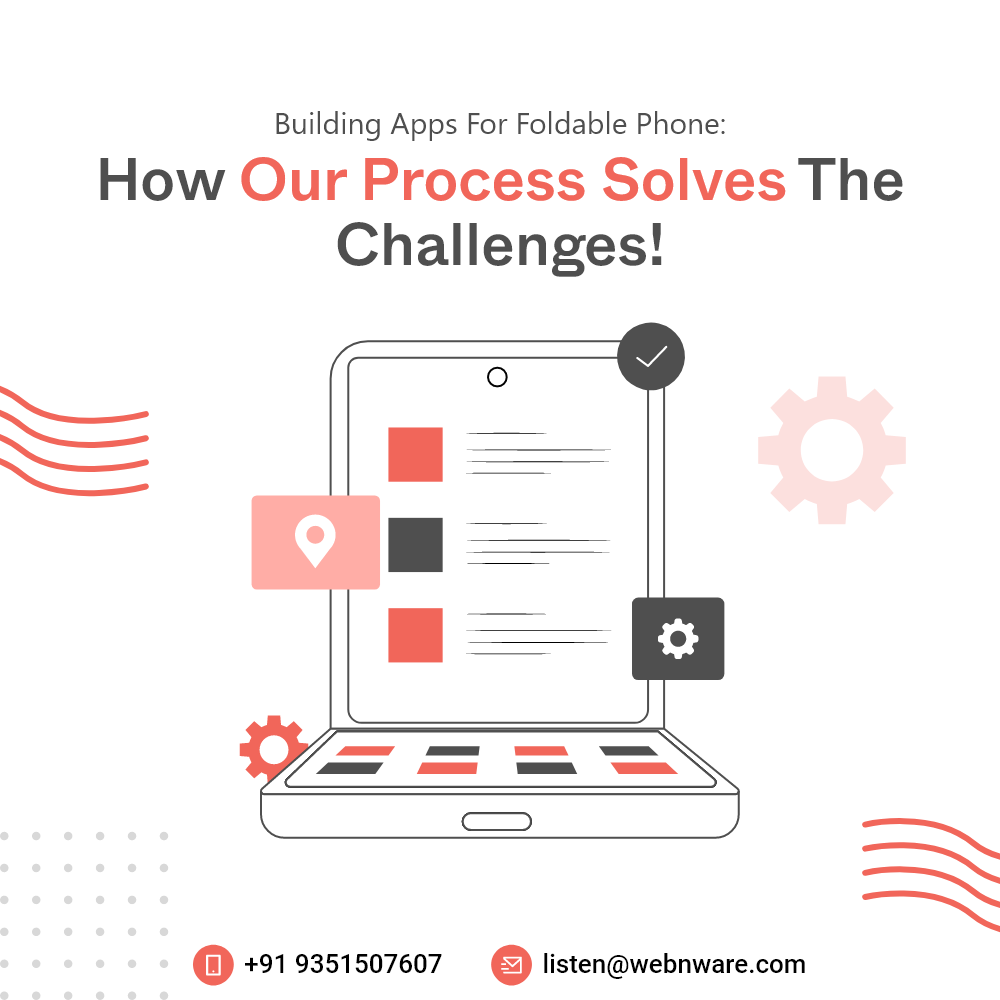
Building Apps for Foldable Phone: How Our Process Solves the Challenges!
By WNW SEO | 0 CommentsWe’ve ad a lot of foldable Android devices coming up since the last 2 years. Most of them have a full screen as large as a mini tablet. Thus, every app development company now needs to make new advancements in their work so as to comply with these phones. When you fold or unfold your phone, you need the app to transit in the new screen size smoothly and automatically. That is the main challenge of app designing for foldable devices. It has to be way more responsive and automatic.
Foldable Smartphone App Development: Let's Open the Secrets
Here’s what you need to do for overcoming the challenge:Smooth Automatic Transition
Just as websites have a dynamic and responsive design to suit all screen sizes, apps need the same. However, for foldable devices, this responsiveness has to be more advanced as it needs to expand as soon as you unfold your screen and contract as soon as you fold it. For this, you need to do dynamic resizing, which can be done by setting the code resizeableActivity=true.Checking for Foldable Postures
There are two types of foldable devices – one that comes with a horizontal fold and the other that comes with a vertical fold. The former goes in a table-top or laptop mode when you unfold it while the latter can open like a book and become a flat tablet. When you’re designing apps for foldable devices, you need to consider both the types.Testing on Multiple Screen Aspect Ratios
With Android devices coming in multiple screen sizes, your app responsiveness has to be more flexible anyway. With foldable devices, you need the app to support long and thin screens and transit to wider screens. Some of the ratios you need to work on include:- 1:1
- 4:3
- 3:2
- 16:10
- 5:3
- 16:9
- 21:9